PURPOSE
I conducted user research for an airline to identify pain points when booking flights and smooth out the UX flow. Part of this analysis was to find out more about the impact of COVID-19 on customers’ expectations. The results were design artifacts that showcased an improved user experience.
Participants said they would pay up to 100$ for a free seat next to them.
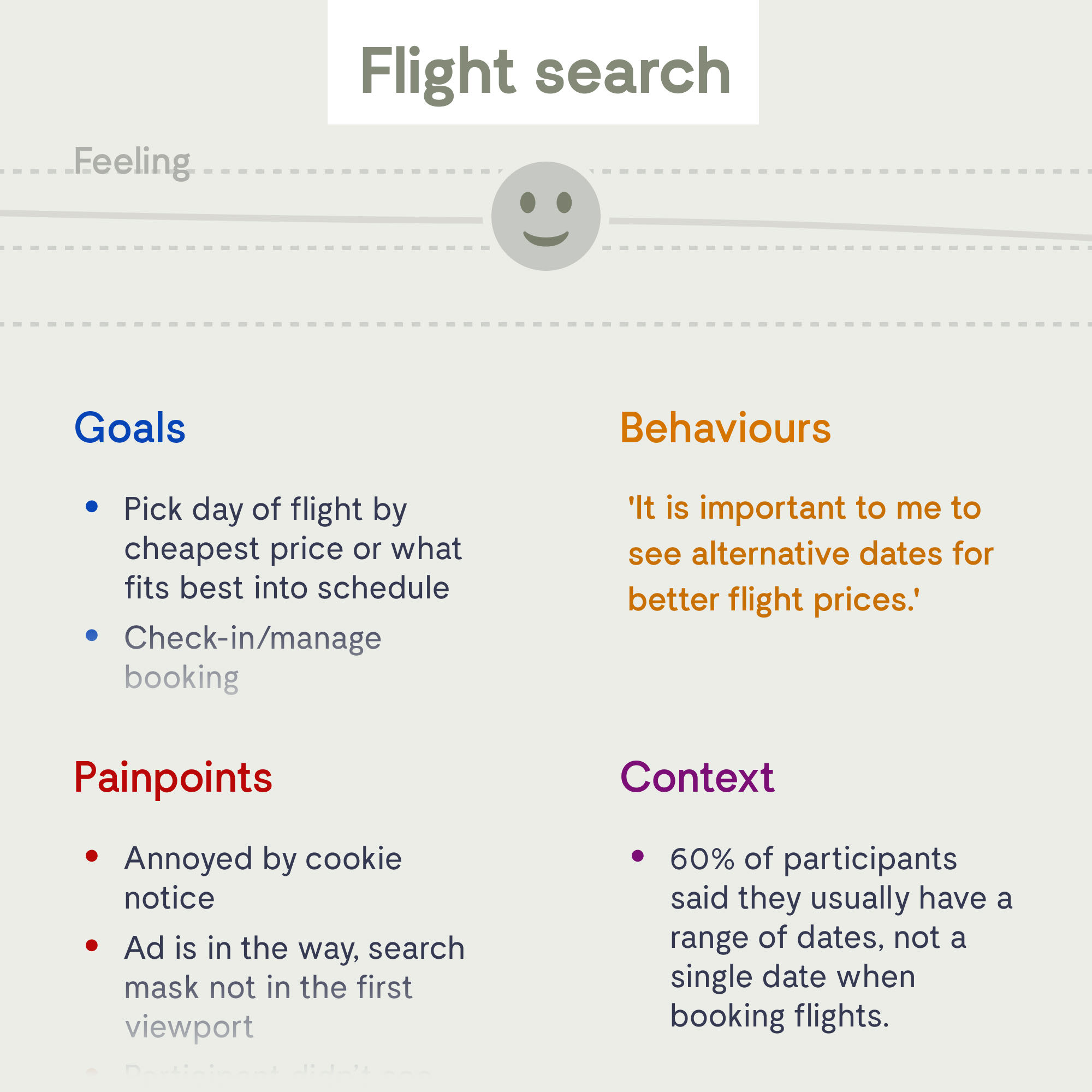
60% of participants said they usually have a range of dates, not a single date when booking flights.
PROCESS
While most people are used to booking flights online, patterns and use cases can differ immensely. We started the research phase with a competitive benchmark, analyzing the UI/UX status quo of the competing market and understanding conventions that should be followed.
Participants were interested in monthly payment options for long-haul flights.
72% of participants said flexibility (cancellations, rebooking) is not important to them.


Once we had learned enough about the context of people that use airline websites, their goals, and behavior, the findings were visualized. Both qualitative (user tests, interviews) and quantitative (surveys, data analysis) research were taken into account.
We aimed for reducing the time/clicks that it takes for a user to finish the process, creating as few distractions as possible along the way while also keeping users’ individual needs in mind.
33% of participants said the location of the airport is not important to them.
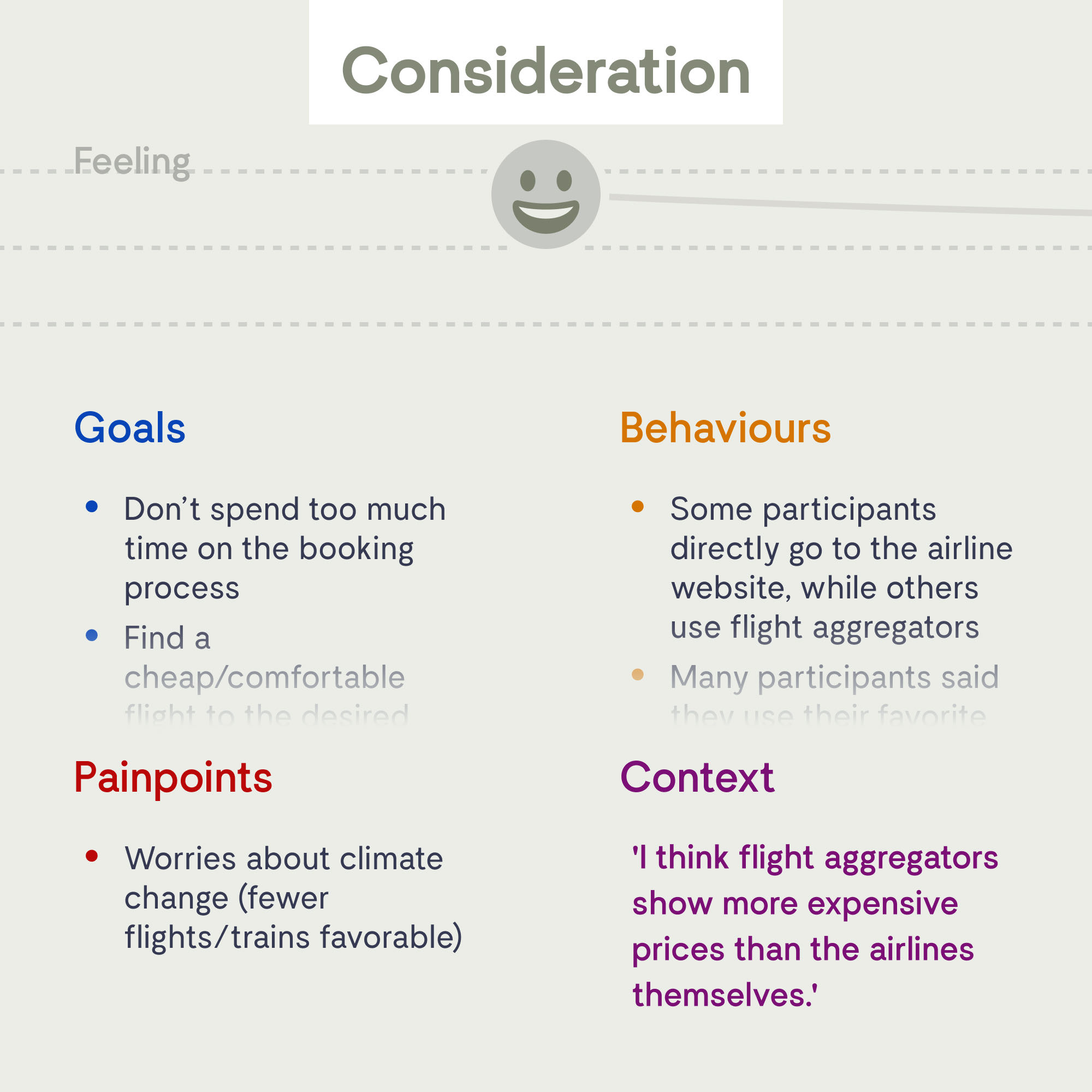
Participants had bad experiences with airlines in the pandemic and lost their trust in airlines in general.

Part of the improvements was a more interactive seat selection, flexibility when choosing dates, and an easier differentiation between fare classes. Our research showed that customers expect airlines to address the challenges of our age, like pandemics or the climate crisis. As a start, to tackle these issues we introduced features like compensating CO₂, improved hygiene measures, and booking a free seat next to you.


To enable us to test this improved booking flow with actual users, I created a basic interactive prototype. Try a version below (please note that the prototype is incomplete since only certain areas were part of the usability tests).


Iterations of the prototype were tested, fine-tuning the booking process. We ended the research phase with detailed wireframes. As this research confirmed, for many users booking a flight is a stressful experience – so a frictionless flow can help increase satisfaction and lower customer churn.


disciplines
I work in
UI UX Product Design Animation Art Direction Branding Strategy & Concept
More cases

LayoutfabrikPrint service meets design agency

MidwayUsing motion to guide users through transportation app

eparoScientific, but human brand for & design system for UX agency

ReflectorHigh-fidelity prototype as proof of concept for self-reflection app

overboardConcept for habit social network

CURVEDData-based tech content for news platform
If you need help with digital design or just want to know how to pronounce my name – I’m just an email away.