eparo — scientific but human brand & design system
PURPOSE
eparo is a research agency for user-centered development and testing of digital products and services. They asked me to develop a new brand, website, and design system for them.
PROCESS
Having worked with eparo for several projects in the past, I knew about their workflows and strengths. The team’s approach is always research-based and users are put at the very core of every product. I decided to visualize both of these aspects and came up with a branding that is both analytical and human.
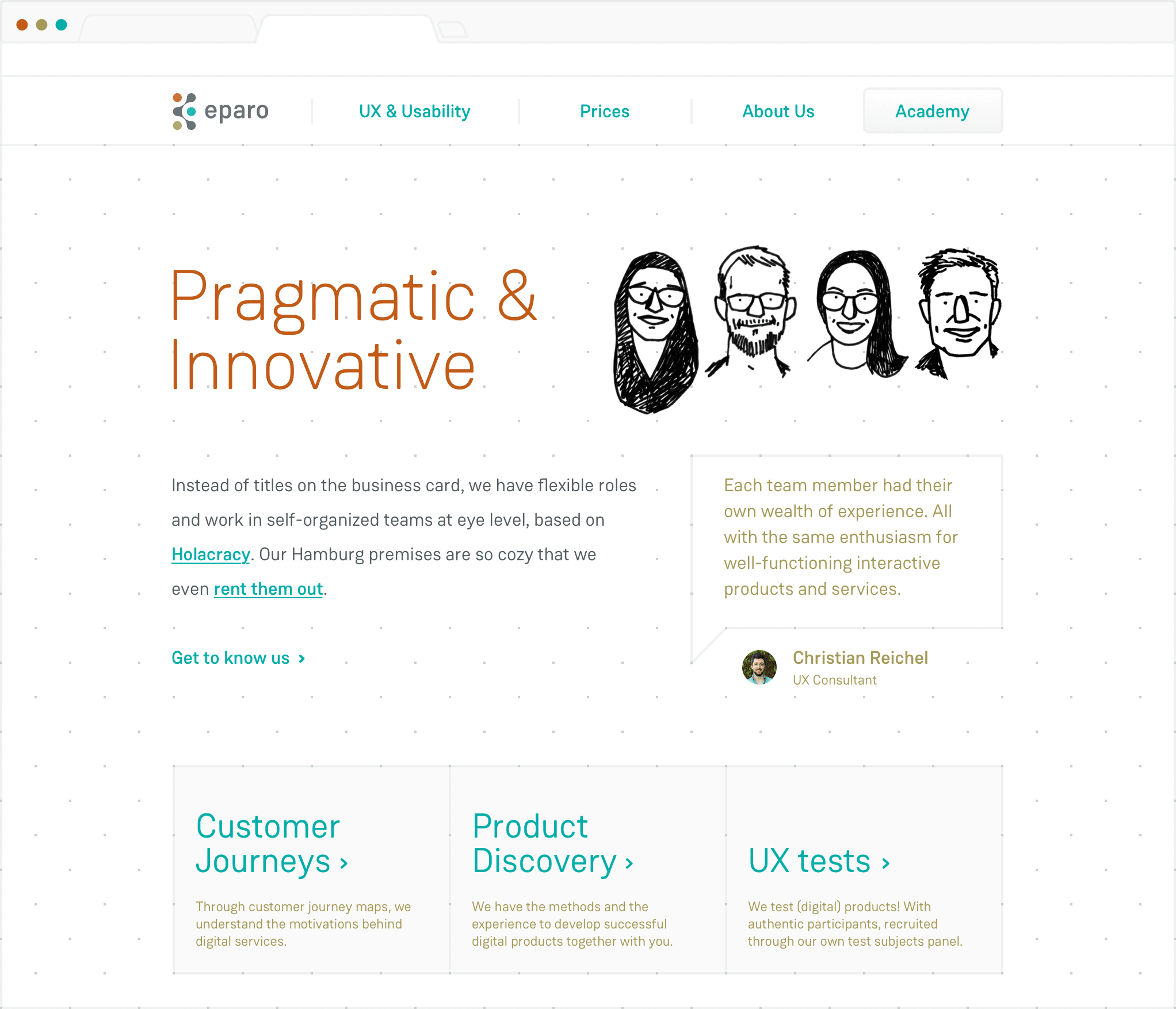
The research aspect of their work was visualized by using a grid and a technical-appearing typeface. The dot-grid is incorporated into every step of their process, from sketchpads to scribble onto, to a grid system on their website. Besides, it allows them to incorporate their brand identity in a subtle way.
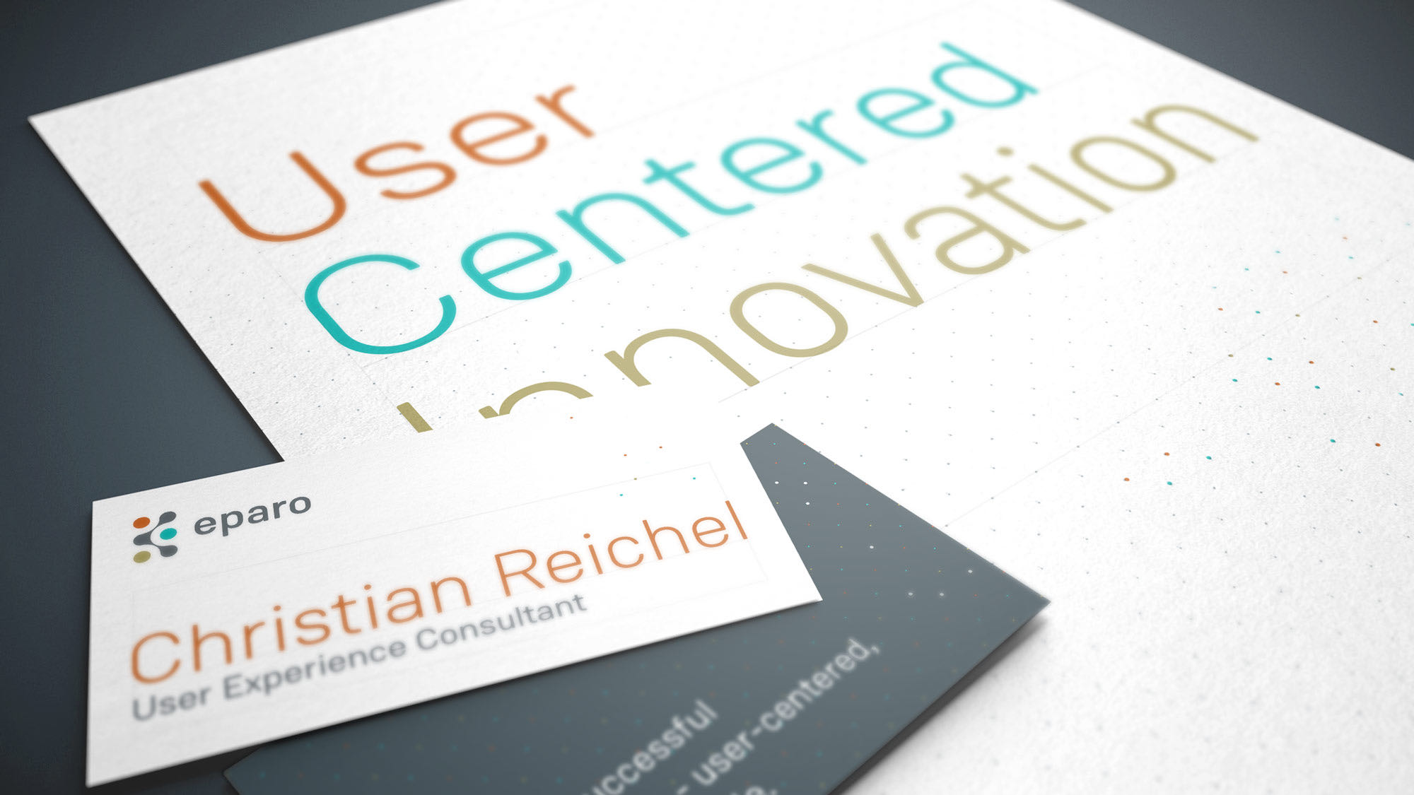

eparo excels at user interviews, scribbling down ideas quickly, and using UX techniques that often involve pen and paper. To acknowledge that, the serious scientific part of their corporate identity was broken up by hand-drawn and hand-written details. The handwritten typeface I created is based on a team member’s writing. The illustrations by Angela Wittchen provide a human touch and even eparo’s CI colors were chosen to be available in their favorite markers.
disciplines
I work in
UI UX Product Design Animation Art Direction Branding Strategy & Concept
More cases
LayoutfabrikPrint service meets design agency
MidwayUsing motion to guide users through transportation app
ReflectorHigh-fidelity prototype as proof of concept for self-reflection app
overboardConcept for habit social network
CURVEDData-based tech content for news platform
Airline ResearchResearch-backed user flow improvements for airline website