PURPOSE
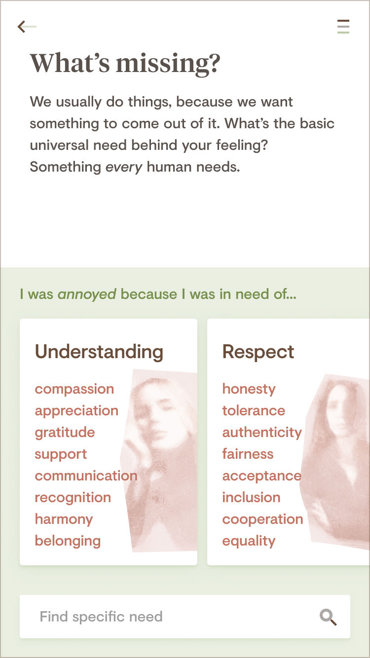
The mission of this passion project of mine is to gain mental well-being through reflective communication. Reflector is an app that lets users find out what their conflicts are really about and helps solve them, as reflective and kind communication is more likely to resolve arguments. There are two ways in which Reflector works: Users can reflect on conflicts themselves and learn more about their needs. There’s also a dialogue mode in which Reflector acts as the mediator between two or more people. Borrowing practices from Nonviolent Communication, the core idea is that the better we communicate and understand each other, the better we feel.

Through asking the right questions the app makes you reflect on a situation you’re unhappy with. It’s designed to keep things light, with insights and more in-depth analysis when you need them. Reflector focuses on communication as a tool in crisis and refers users to other resources when that is not enough.


There are language translation apps that translate in real-time, allowing people from different backgrounds to understand each other. What if there was something like this for feelings, needs, and opinions? Reflector guides people through a mediation process and helps calm down the situation by finding the right words.


PROCESS
Reflector is all about language. Finding the right words to communicate your feelings makes the difference in getting your point across. Words have different connotations for different people, so one major challenge of the concept process was to actually define categories of words and classify them. When reflecting on a conflict users shouldn’t have to face a list of hundreds of words that could potentially describe their emotional state and be overwhelmed by choice. Luckily, lots of research* has been done in that field that helped consolidate expressions.
* Reflector’s classification of emotions and needs is inspired by Maslow’s hierarchy of needs, Max-Neef’s fundamental human needs, Plutchik’s wheel of emotions, and Ekman’s emotions as universal categories.

Because of the importance of words, Reflector’s UI is heavily based on text and voice interactions. The app spots phrases that could be expressed kinder and suggests alternatives. The tone of voice is just like talking to a close friend, understanding and forgiving. Reflector also has a dedicated section that helps you understand the principles behind communication. I created an extensive database for words that express feelings and needs. Removing hurtful expressions is key to bringing people together in a conflict.
Testing an app with actual users is always crucial – with Reflector revolving around sensitive topics it becomes even more important. I created a prototype that grew with the project and allowed me to test out different user flows. Try it for yourself!
Creating illustrations for the mental health space can be challenging, as it’s very easy to step into stereotypes or the overly dramatic. My approach was softly painted illustrations that leave room for independent interpretation. They provide context and are serious enough for tense use cases, while staying hopeful. With Reflector I wanted to create an app that takes you seriously while making you feel better.


disciplines
I work in
UI UX Product Design Animation Art Direction Branding Strategy & Concept
More cases

LayoutfabrikPrint service meets design agency

MidwayUsing motion to guide users through transportation app

eparoScientific, but human brand for & design system for UX agency

overboardConcept for habit social network

CURVEDData-based tech content for news platform

Airline ResearchResearch-backed user flow improvements for airline website
If you need help with digital design or just want to know how to pronounce my name – I’m just an email away.