Interfaces are the connection between us and technology. I see my role as designer to make tech more human. It should be obvious how to use a product just by looking at the UI. While I also strive for beauty, a seamless user experience is my highest priority.
Layoutfabrik, a printing service plus design agency, asked me to develop a design strategy and UI/UX for their product. Apart from simplifying their whole service process, I created an interface that is inviting and engaging.
CASE
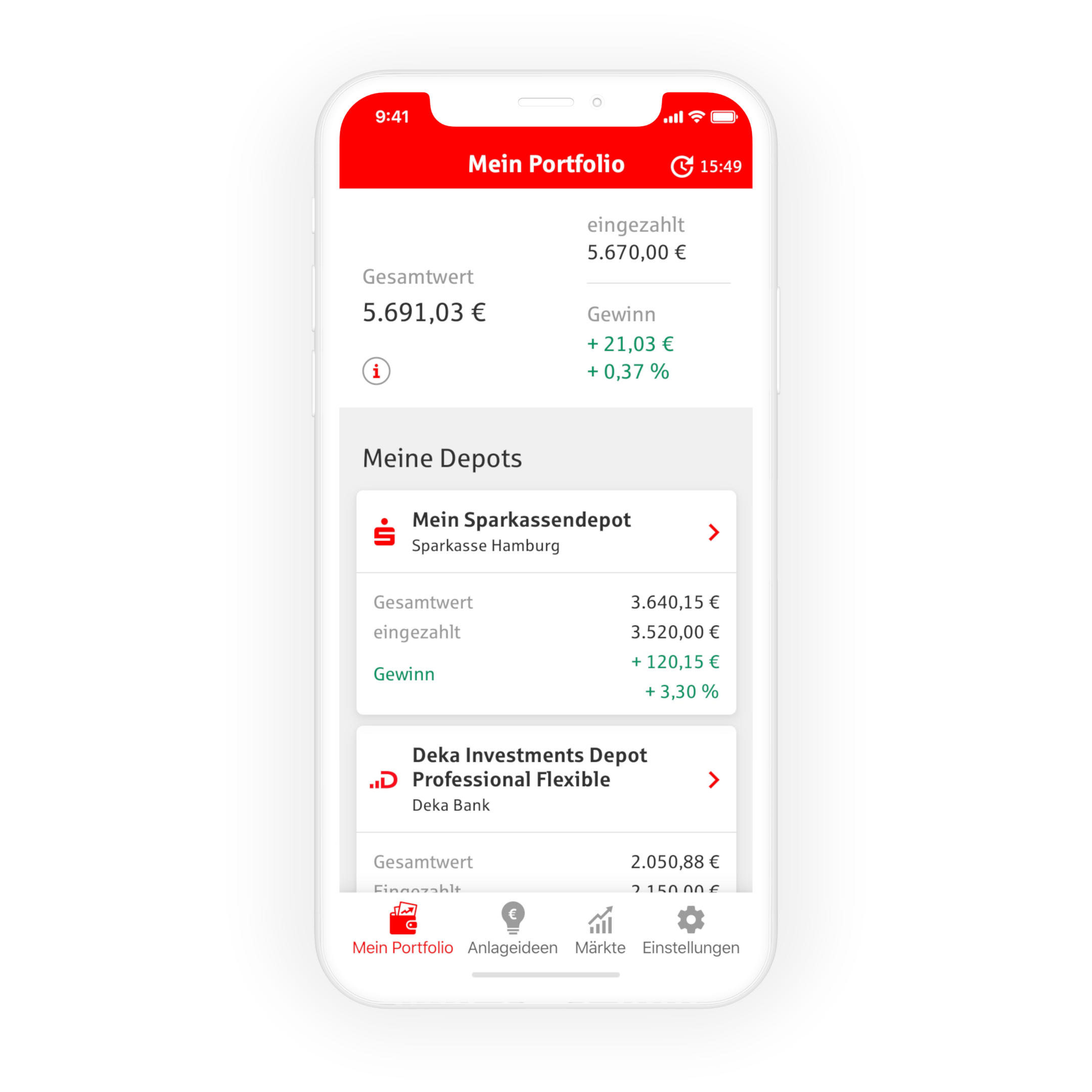
I developed the design for S-Invest, a portfolio app for Sparkasse, one of the biggest German banks. A major challenge was to keep functions simple, as usability tests showed that many users were overwhelmed by the sometimes complex finance world.

Midway helps users find a spot that lies halfway between them and their friends. The UI that I developed uses motion to guide users.
CASE
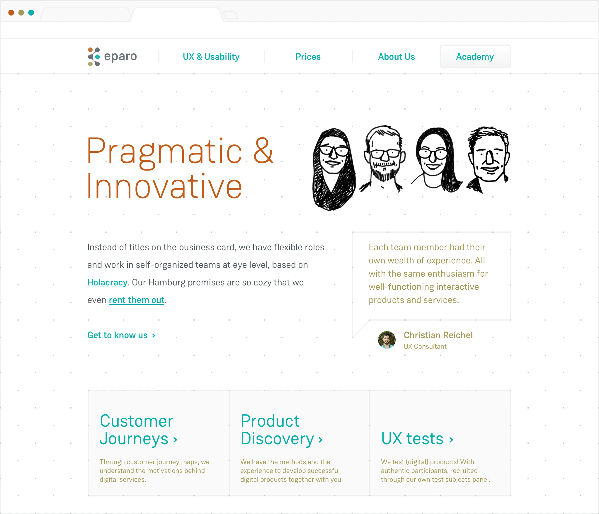
I created a new website for eparo as part of a rebranding for the user research agency. The team brings a scientific, but also spontaneous approach to UX. I expressed these core values visually in their brand and website, based on a visual grid system.
CASE


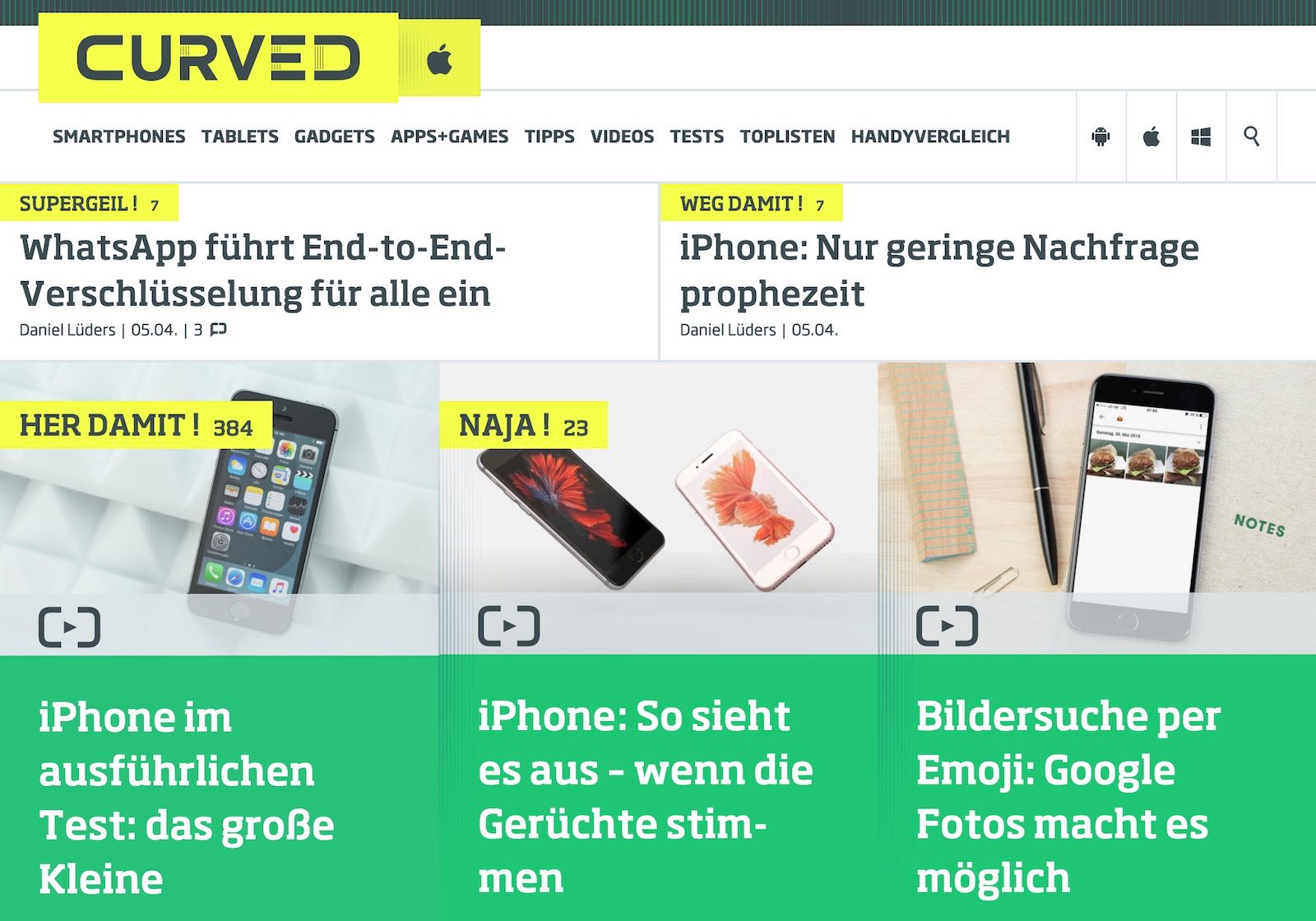
I was part of the team that created the design for the tech news portal CURVED. The UI is reduced as much as possible to let the content dominate.
CASE
If you need help with digital design or just want to know how to pronounce my name – I’m just an email away.