When designing digital products, motion is an often overlooked aspect with an incredible potential for an improved user experience. Animated modules can help guide users and make interfaces more engaging. I incorporate animations into the design when they elevate the product.
By designing Midway, a transportation app, I explored the idea of relying heavily on animations for the interface. It’s a good example of how UI animations can guide through user flows and help users navigate by providing visual feedback or gaining focus through attention.
CASE
For overboard, a social network concept for habits, I produced this case film. Reduced shapes morphing into one another tell the narrative. Simplistic visuals go hand in hand with the idea of the app to reduce unnecessary habits.
CASE


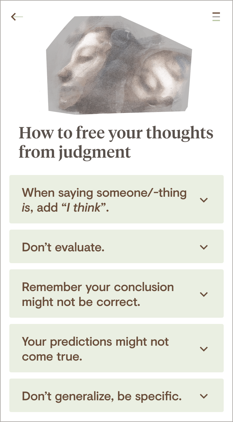
Reflector’s logo symbolizes a person in front of a mirror. The abstract shapes reappear as core elements in the actual app that helps solve conflicts through reflective communication. Being in constant but subtle motion, the two shapes provide a more organic feel to the app while also providing a constant graphic element that users recognize and associate with the known.
CASE
I produced Zeit, a music video for Christian Löffler’s Swift Code (English subtitles available). Dealing with the topic of the Holocaust, all illustrations revolve around the topic of time and repeating cycles. Halfway through the video the narrative changes, revealing images of World War II. The hidden images, only unfolding their true nature at a second glance symbolize how bitterly easy it is to forget.
If you need help with digital design or just want to know how to pronounce my name – I’m just an email away.