I make products as friction-free to use as possible. Designing is all about understanding your target group – their goals, behavior, and context. For me, research should always be the base for UX, rather than making decisions based on assumptions. So whenever possible, I put the product or prototype in front of users and observe. A solid UX is a frame for all other disciplines and no matter what I design, I try to look at it from the user’s perspective.

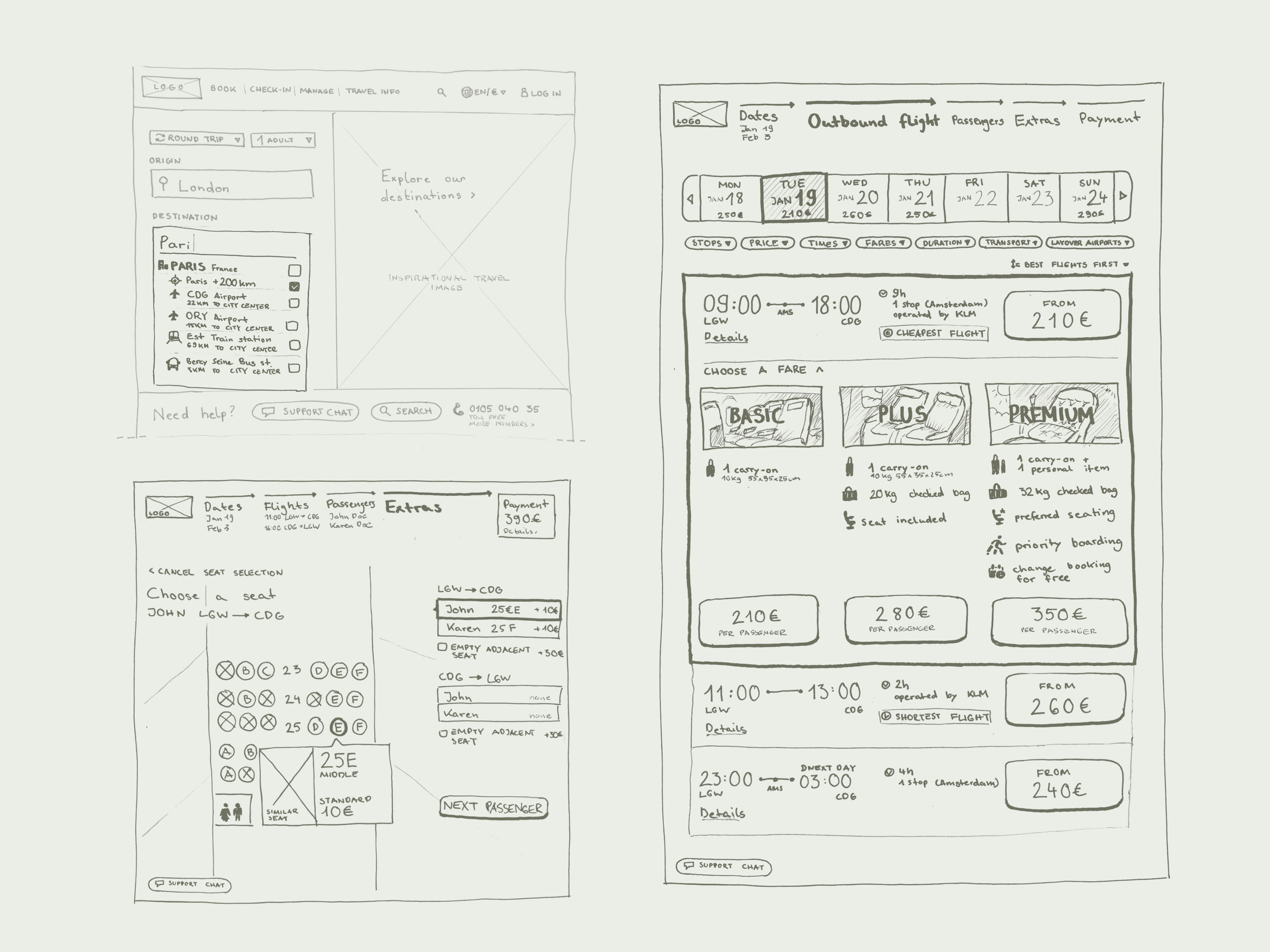
I conducted intensive research to smooth out the UX flow of an airline website. Through interviews, structuring data, and testing high-fidelity prototypes on users I was able to slim down the booking process and add features that users were missing.
CASE
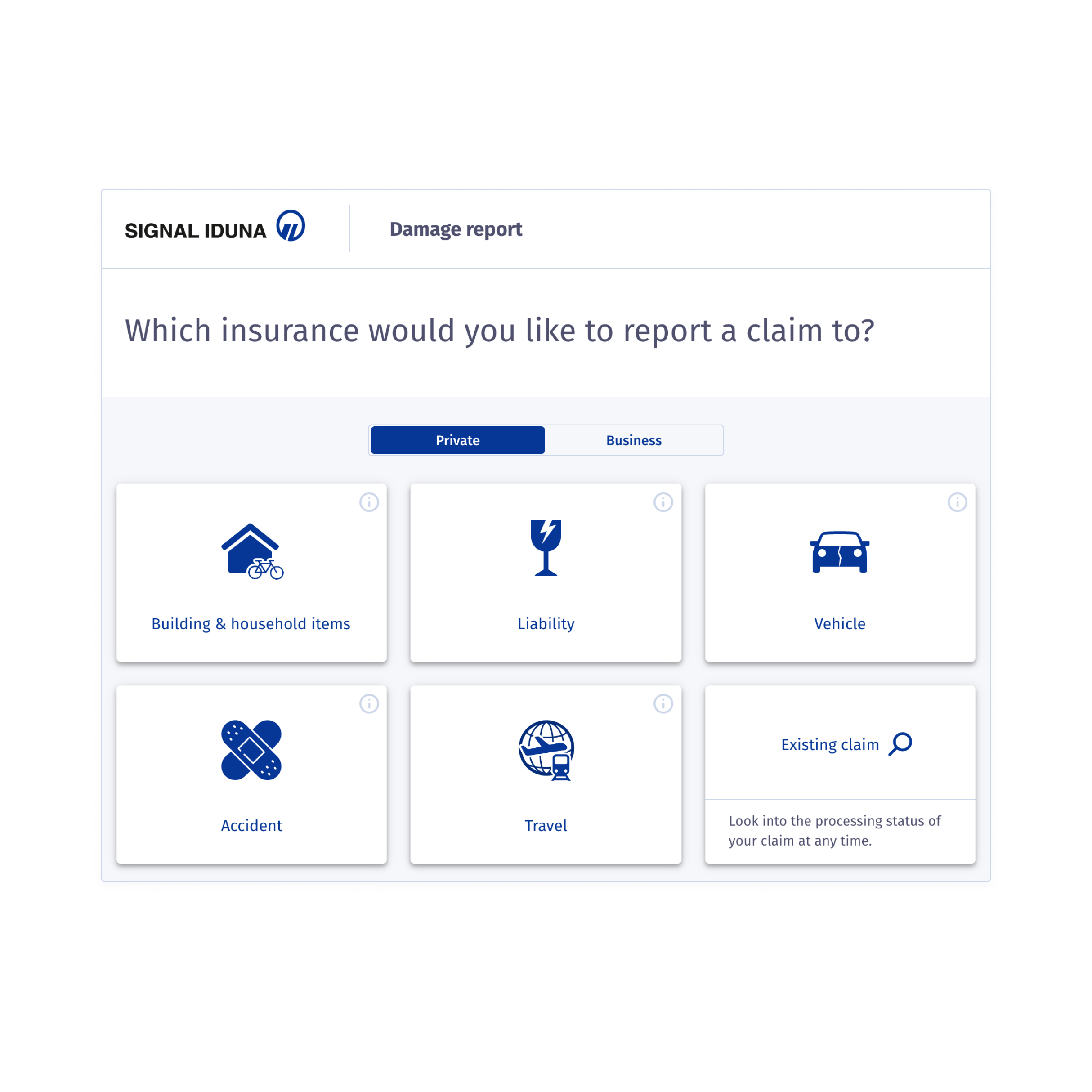
I was part of a team at Signal Iduna (one of Germany’s top insurance companies) that worked on the process of filing insurance claims online. We wanted to create a flow that takes the burden of claiming a file, making it as effortless as possible, so customers have one less thing to worry about. The UX flow was tested regularly on users.


Reflector is an app that lets users find out what their conflicts are really about. As the nature of the product is sensitive and sometimes complicated I used a prototype to validate design decisions and iterate.
CASE
KYP uses software to analyze business processes and through AI finds optimization and automation potential. I was part of the design process that focused on creating a product that is easy to use but also gives power users the option for in-depth analysis and optimization.

If you need help with digital design or just want to know how to pronounce my name – I’m just an email away.